

 Now the Screampunk District has opened at Six Flags Magic Mountain, Scream! has ‘reborn’. It finally received the attention it deserved, and along with the new area, it looks great. Six Flags Magic Mountain created quite a unique style for the ‘new’ Scream!. They combined the old slogans and ‘theme’ of the ride with the new steam-punk theme. Let’s take a look.
– Recently our images have popped up on other sites and forums, awesome that our coverage spreads, not so awesome that no one mentioned where they got the images from. We are totally fine with our audience using our images, BUT ONLY IF credit is given to californiacoasterkings.com. Thank you! –
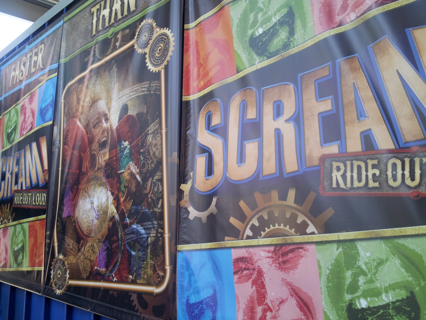
When you pass by the GearWorks Theatre on your way to Scream! (And Twisted Colossus of course), you’ll see the large Scream! ad. The ride on the banner is actually Acrophobia from Six Flags Over Georgia, nonetheless, the ride is getting some serious attention already. Instead of praising Twisted Colossus, and forgetting about Scream!, Scream! is receiving just as much attention in the area as Twisted Colossus is. 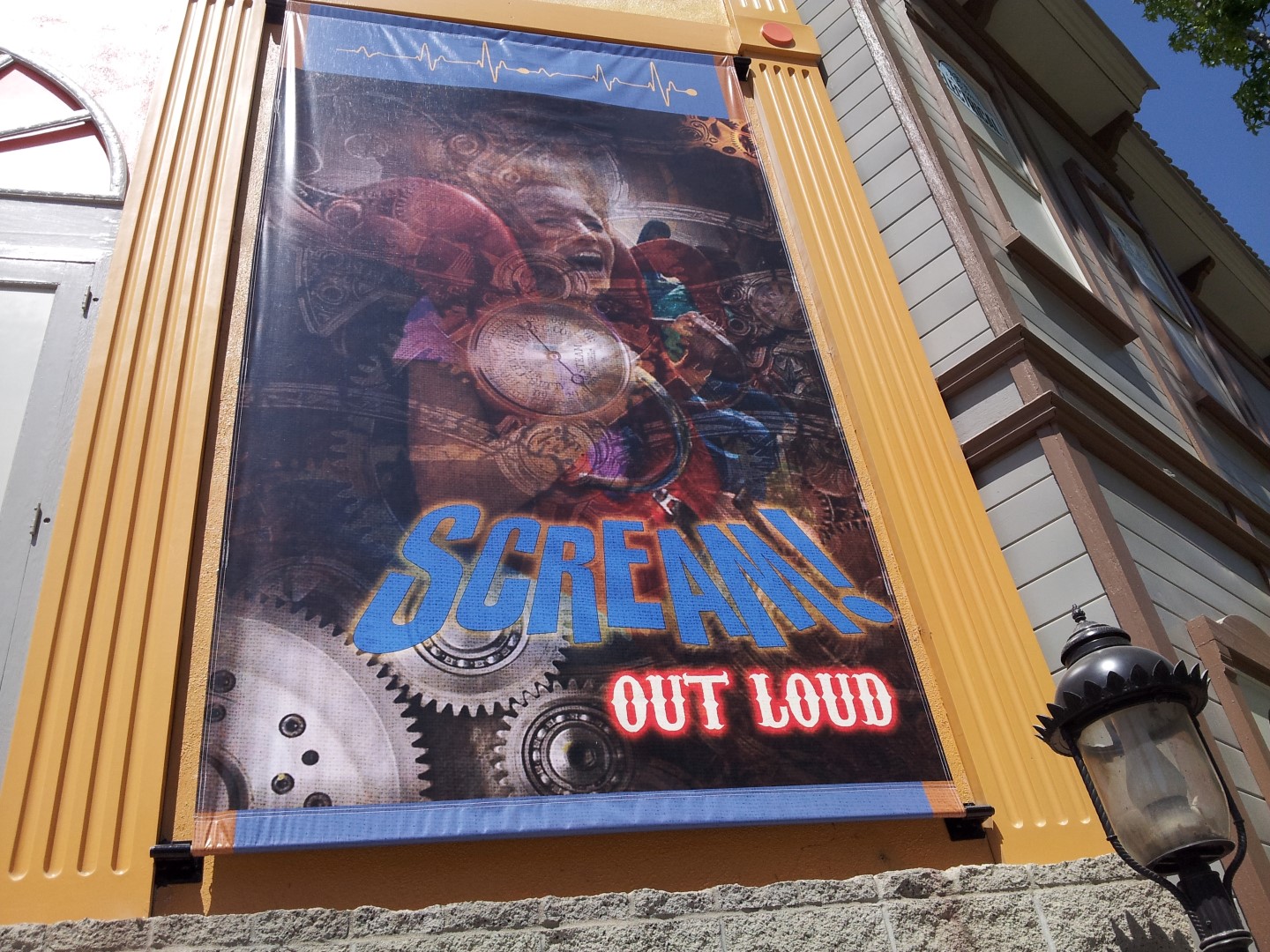 Above you may have noticed the steam-punk touch that the Scream! banner received. These lamppost banners are smaller versions of the large ones on the side of the theater, and are to promote Twisted Colossus, Kwerk (new show), and of course Scream!. They’re found mostly on the pathway down to Scream!.
 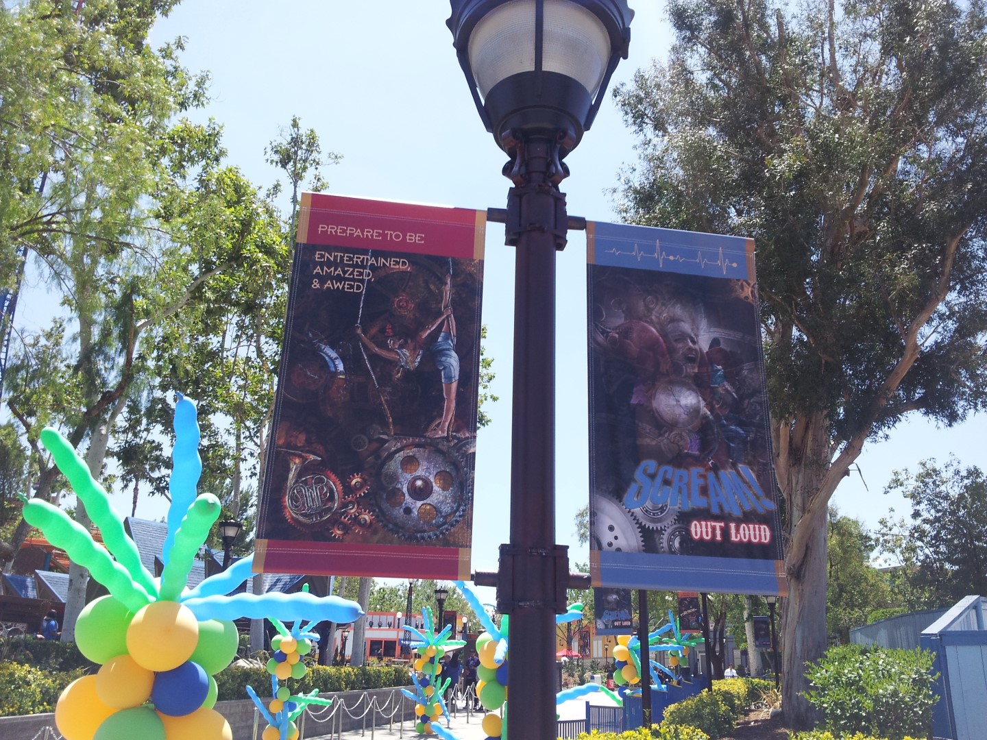 Then we get to Scream! Looking fresh with its new paint-job. (Believe it or not, Scream! is literally so sun-exposed, that the paint on the supports is already noticeably fading).
 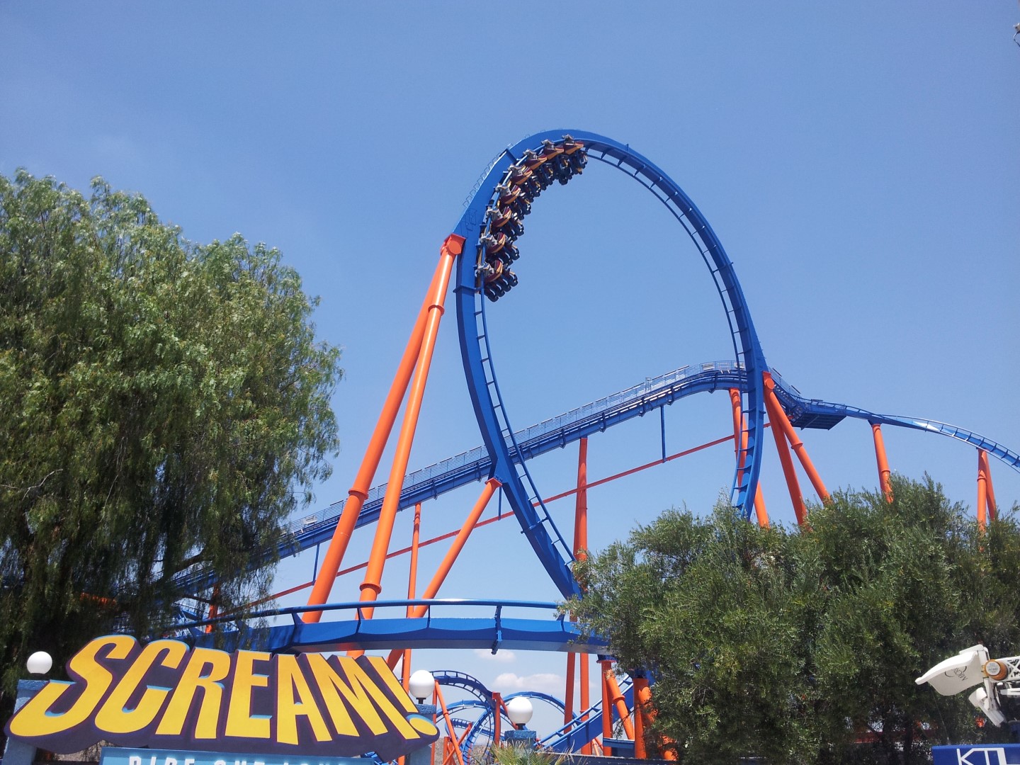 The ride received a brand-new sign at the entrance, which looks very nice. They can easily repaint it, and it stands out way more than the old sign. In addition, though the ‘Scream!’ part of the sign looks 3D, it’s painted to look that way, the ‘Ride Out Loud’ part of the sign is in fact 3D print. The screaming faces below and the font of the words are a great way of showing how the old Scream! character meets the new theme of the area. It has a steam-punk touch that’s actually really fresh.
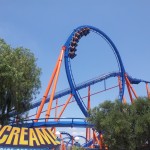
 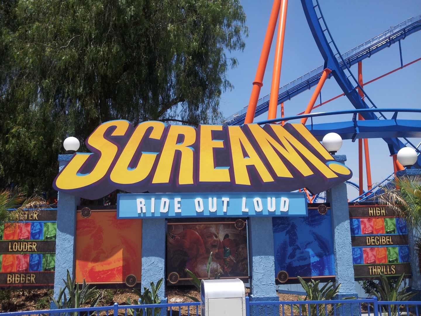 Here’s the incredible new look of the ride. The parking lot is still noticeable below. But, since I’m so used to it, it doesn’t bother me. Floorless coasters in California are just built over former parking lots 😛 . As you probably have seen above, the trains that are currently operating on the ride are both still the old colors. The third is currently being refurbished and will return matching the new colors. At first, I really thought I’d dislike seeing the old colored trains on the newly painted ride. In all honesty, I’m loving the purple-yellow-blue trains on the orange-blue Scream!. And considering that the logo remains to have yellow, purple, and blue in it, I wouldn’t mind seeing these colored trains around for a bit longer.
 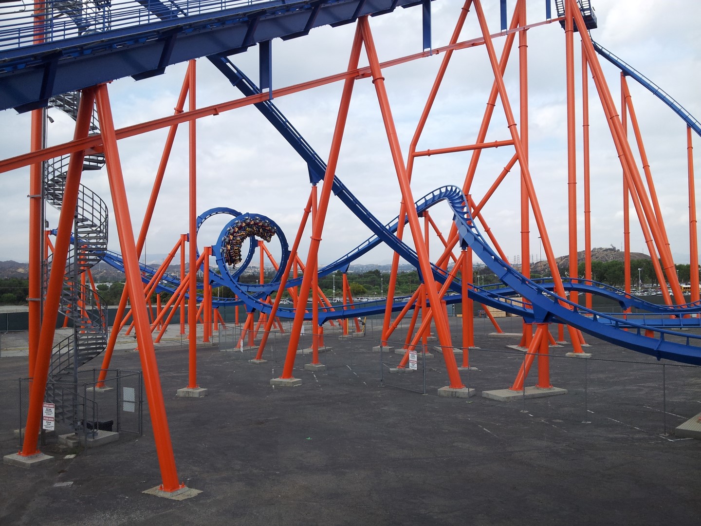 Let’s take a look at the line! First off, all the signs (no matter what size or purpose) have been replaced to match the bright, yet steam-punk, ‘theme’ of the ride.
 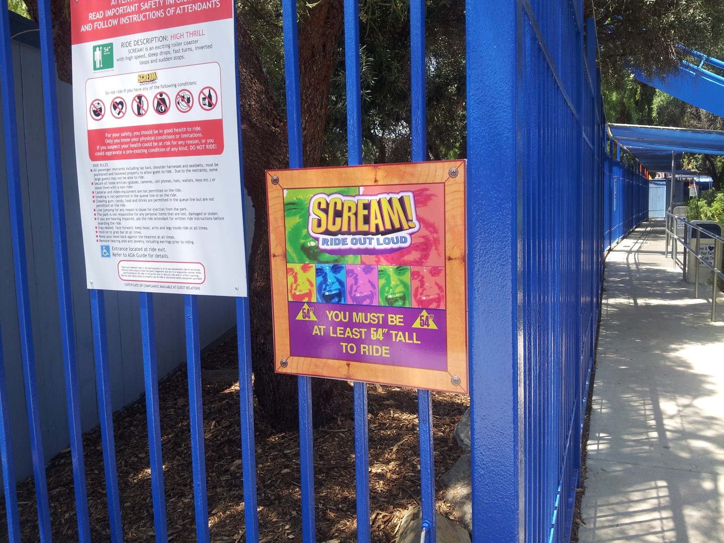 The fences and walls in the line have been painted different shades of blue. The fence is the same shade of blue as the track, the wooden wall opposite of it has different shades of blue. The line looks refreshed, there aren’t any big changes, but it looks very refreshed nonetheless. With Twisted Colossus right next door, this line is actually being used now. (The attendance in this corner of the park was very low the last few years).
 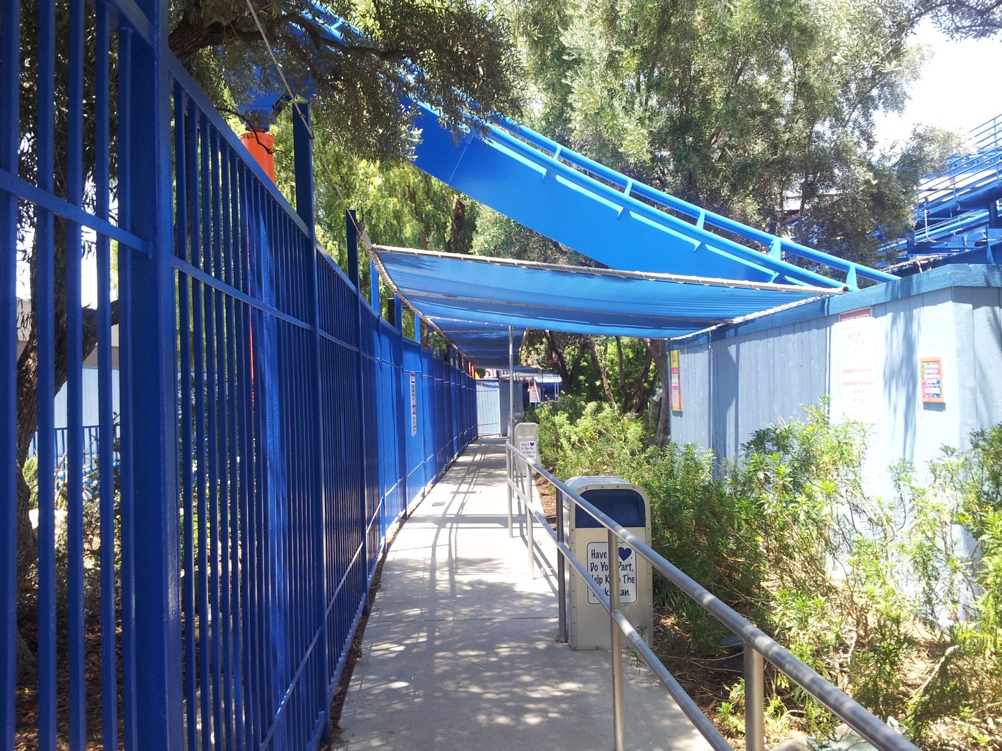 The line-jumping sign has been replaced, looking very similar to all small new signs around the ride. Now I wish they’d add these to rides that have switchbacked lines, because I’m convinced most line-cutting takes place where hopping over a hand-rail saves you 10-15 minutes of waiting line. (Tatsu, X2, and Twisted Colossus for example).
 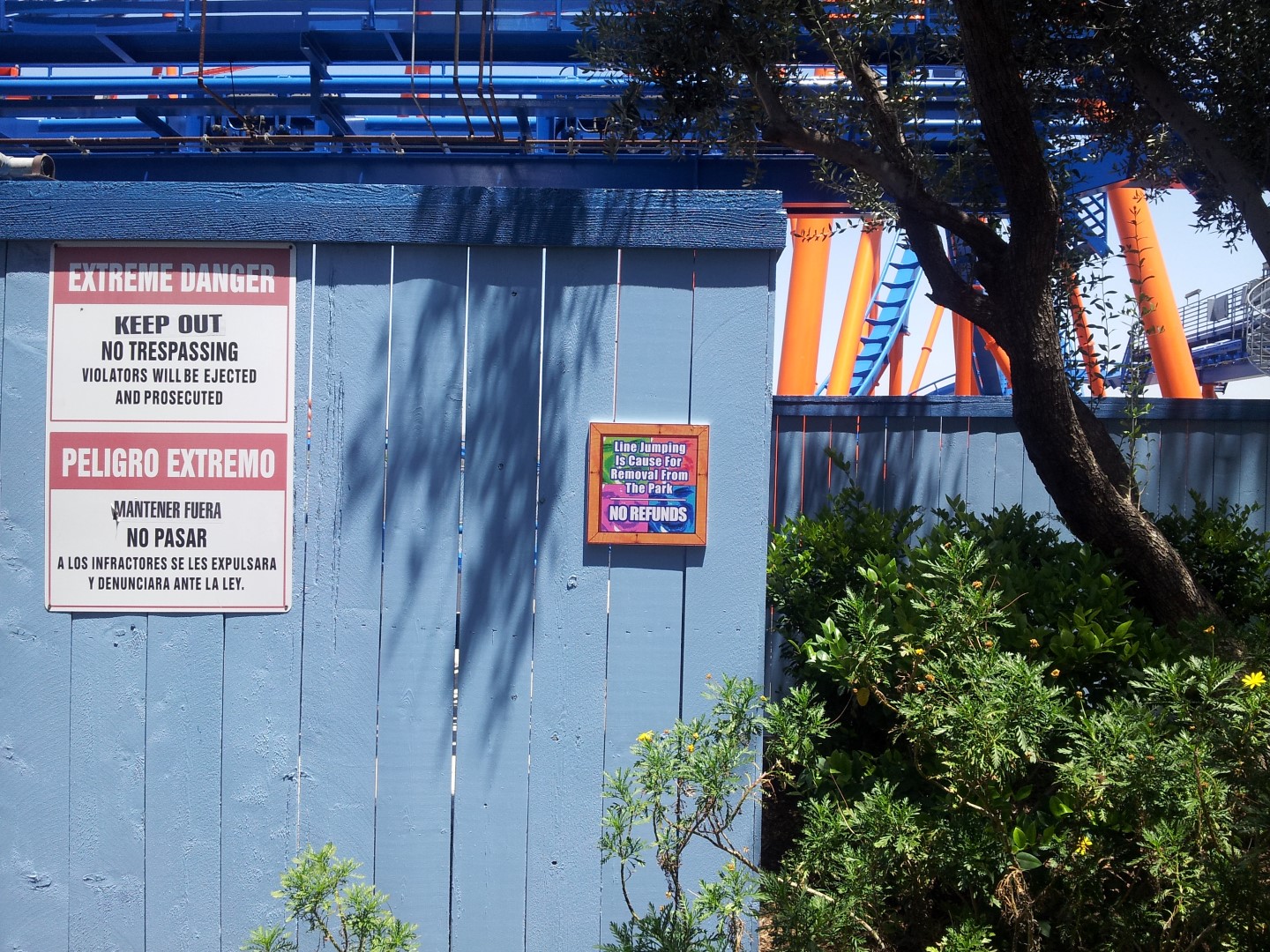 Once you get near the stations and the lockers, more new Scream! logos and banners can be found, as well as new screens right below the track above, which prevents grease/oil leaks to hit exiting guests.
 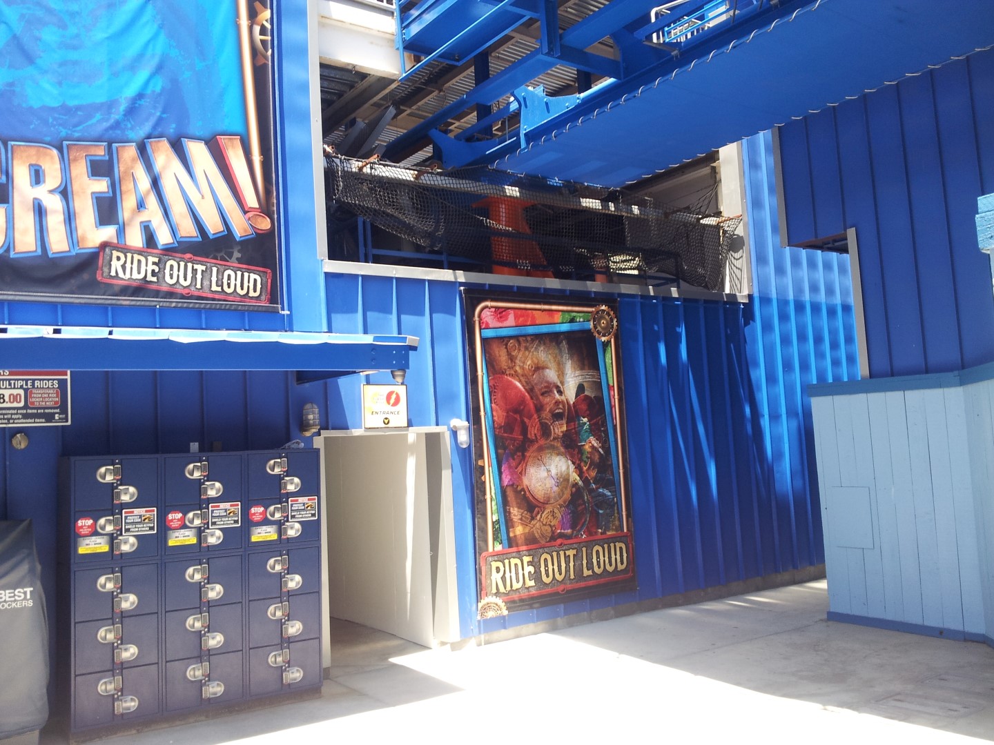 It may look a bit simple, but that’s all that this ride really needs. The ‘Faster, Louder, Bigger’ approach is still very present. The ‘Louder’ part they’ve got right, dang this ride roars like no other. Notice that the Scream! logo on here is ‘Scream-punked’, and is gold and blue rather than the yellow and purple.
 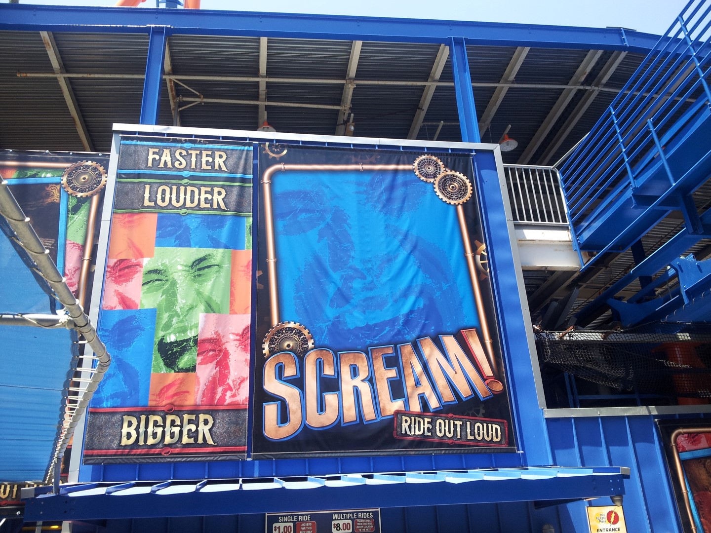 The stairs to the station have been repainted blue as well. It used to be purple, but looksk fresh now.
  On the side of the station and the stairs, more steam-punk influenced banners and signs have been hung.
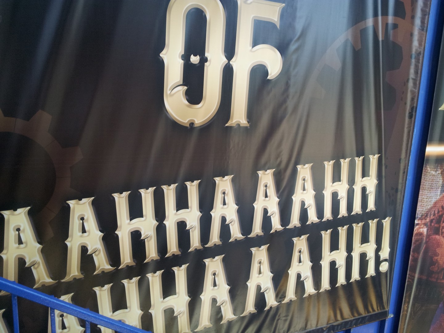
 Inside the station, it looks like they did half a job, really. The park decided to repaint the yellow lights orange, to match the new color-scheme. Yet, the park left all white parts of the ceiling unpainted. This is a bit of a shame, since it looks very rusty, and they literally repainted the entire Twisted Colossus structure, I’m positive enough white-paint was left for the station ceiling of Scream!. I do though like how the air-gates are still yellow. That yellow touch every once in a while, I like that.
 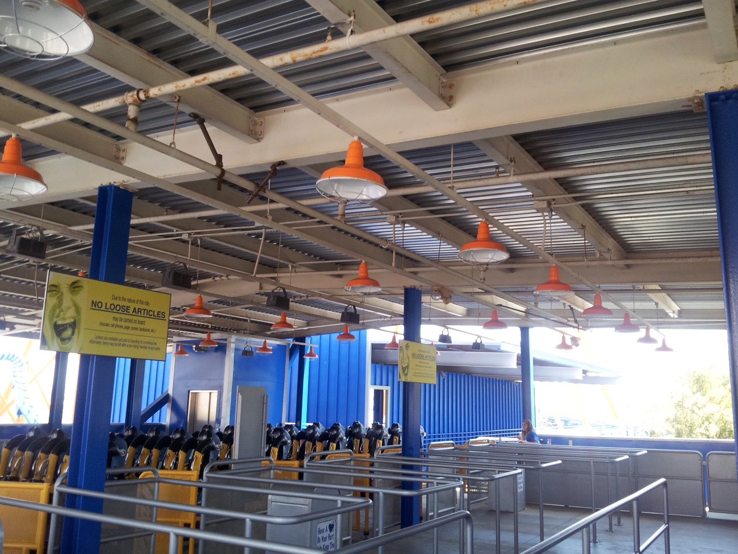 The Scream! sign hanging in the station has been updated just this week. The Screampunk version of the logo has replaced the old faded sign. The train exits the station passing under the banner. From the parking lot, the other side of the banner is seen, which is the same.
  The ride experience is… pretty much the same, really. It’s a bit smoother as the trains have been tightened up. Though, pay attention… when the train is empty, it shakes so badly, you might want to wait for more guests to show up. It rattles and even gave me a crazy headache, and I can’t think of any other ride that has ever given me a headache. Now… when the train is filled, even 25%, the ride is smooth and rolls along the track just fine! 😀
 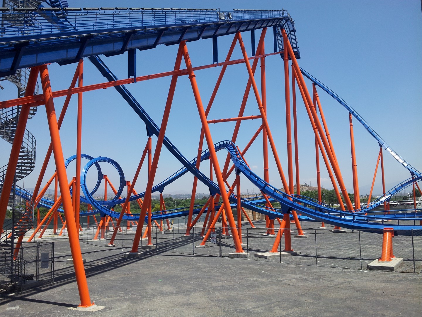 Once you exit, you’ll notice the new exit signs. Again, same new ‘theme’ to them.
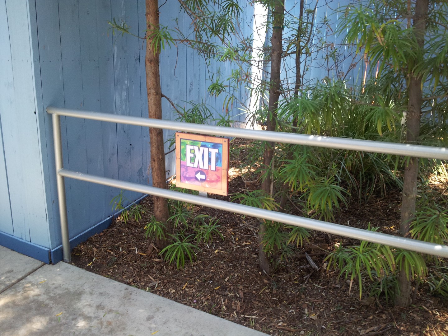
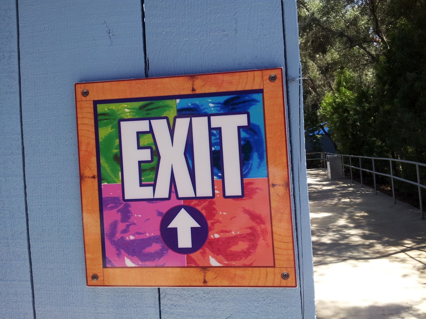
 After passing under the loop, you’ll pass by the old photo-booth. The on-ride photos were stopped early 2013. The booth still stands here unused, though nicely repainted. Several rumors are spreading that the on-ride photos will return to Scream! now there’s more ridership. (I don’t expect it too soon, even Twisted Colossus’ on-ride pictures have yet to become reality). I will investigate whether or not the cameras will return to Scream!
  Here’s one last look at the new sign at the entry plaza of Scream! The park gave the ride the attention it deserves, and I’m very glad that the Scream! is receiving the attention and promotion throughout the Screampunk District. The ride’s a good solid ride in the park’s line-up. It never really stood out, since the park is home to coasters way better. Nonetheless, I’d like to acknowledge that it has a pretty good capacity, provides a fun ride, and if it were to be located in any other Californian park, it’d be a lot more popular. Luckily with Twisted Colossus and the face-lift it received, a lot more guests will enjoy Scream! for years to come, but again it doesn’t stand out much (though it definitely is a crucial member of it) at a park with, arguably, the world’s best coaster line-up.
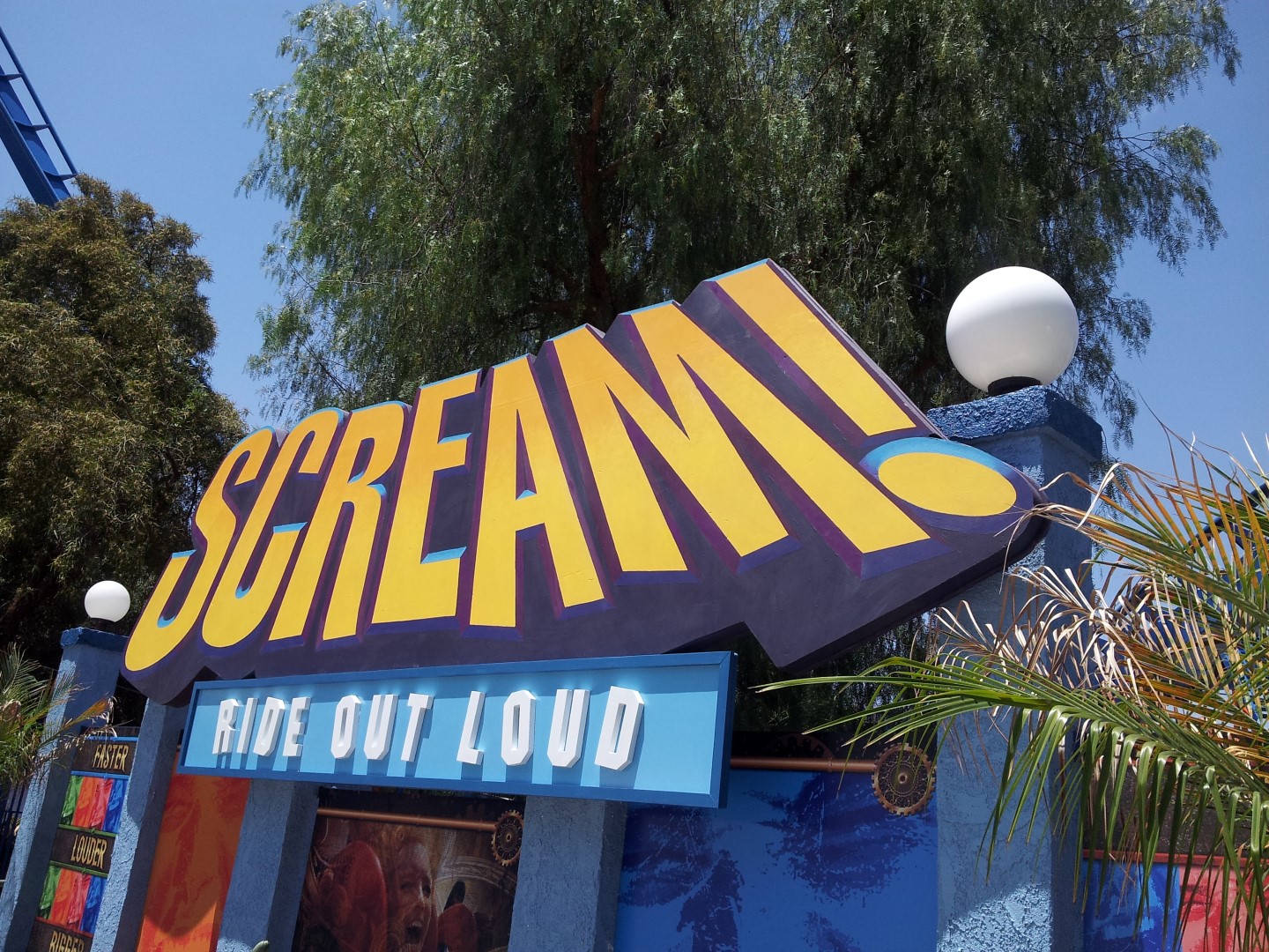
Please comment your thoughts of the ‘new’ Scream! below, let us know what you thought of this article, and what you think of the repaint, train colors, and new ‘theme’! Also, and I usually don’t ask this, but if you like what you read, please share this article on your social media! 😀
Thanks for checking out this article of Scream!’s ‘rebirth’. Make sure to check out the following articles related to the new Screampunk District:
- Twisted Colossus and Screampunk District Media Day Report
- Twisted Colossus Ride Review
- Twisted Colossus videos
- Twisted Colossus and Hurricane Harbor Opening Day
Follow us on our social media for exclusive coverage!
Excellent article! It was very meticulous and you really caught all the minutiae surrounding the ride and area. I also agree very strongly that if this ride were located at any other park in the state it’d be a flagship attraction. The lengths people go to criticize a quite decent ride is baffling. Again, great read, thank you!
Thank you!
Great article,I really love how the colors stand out, it’s different from something I would normally expect to see from six flags, but I’m glad they did it. And to fix the issue of no credit given on your photos, I would put your logo on the bottom corner of every photo.
Great article!
Can you post an audio file with the screampunk soundtrack?
So is Scream open now? Trains rolling?
Admittedly, I was sort of hoping they would pawn Scream off to a sister SF park, and re-do Riddler’s Revenge to be a floorless (I think that design would be better as a floorless, like Rougarou). With that said, the line is still short on Scream (relatively speaking), and it’s a decent enough ride.
What invertedio said FTW ^
I think if they just added a few effects to Scream! like the ones they have on Bizarro, it would be an A+ attraction. Also, the next ride they should repaint is The Riddler’s Revenge. Talk about sun exposure.