
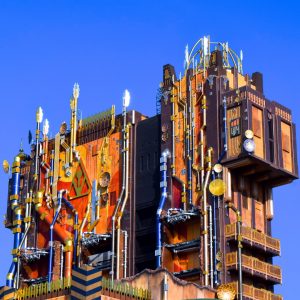
 Sean: Guardians of the Galaxy- Mission: Breakout! is already well received by many, and there are still plenty of Disney fans that are upset that Tower of Terror has left Disney California Adventure Park. We’re actually quite excited for the relaunch of the drop ride and the ride looks surprisingly much better than the original concepts! Let’s take a look at the exterior as of the first week of April:
– Over the years, many of our images have popped up on other sites and forums, awesome that our coverage spreads, not so awesome that not everyone mentioned where they got the images from. We are totally fine with our audience using our images, BUT ONLY IF credit is given to californiacoasterkings.com. Thank you! –
There it is, sticking out above the Food and Wine Festival crowds! The sides, particular on the bottom, are much like the Hollywood Tower hotel still, as where the top and front of the 199 ft tall tower look almost unrecognizable. 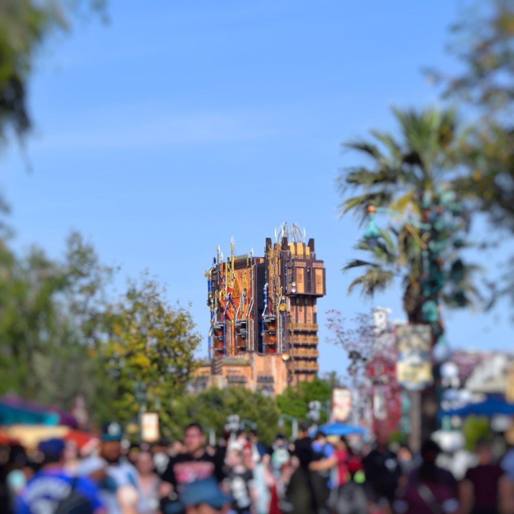
The color scheme for the new tower is awesome, and the sheer amount of small little details look great. Though the tower still clearly resembles the original attractions, I think it’s about as good of a job of retheming the tower as one can do. 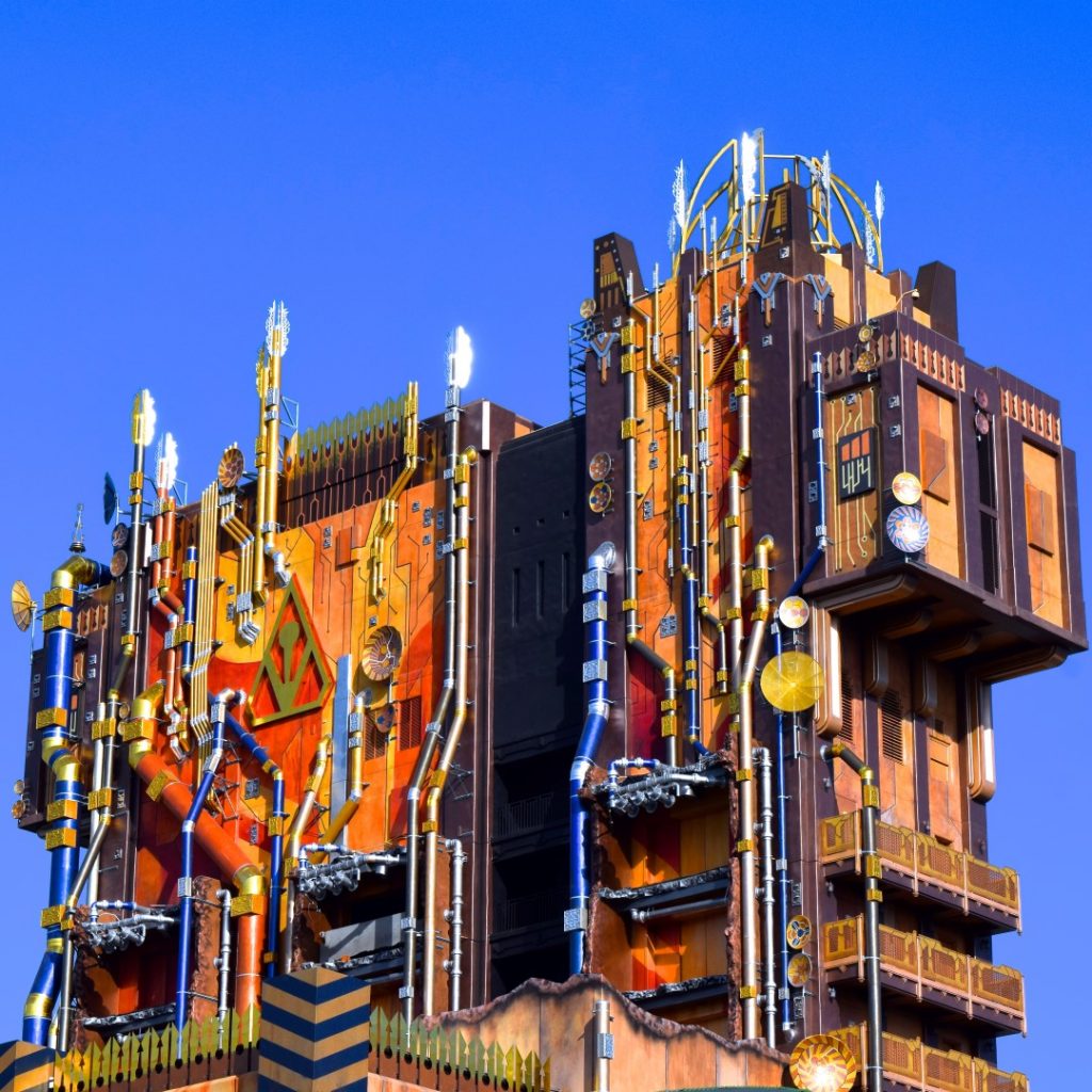
Here’s what the tower currently looks like from the front. They used a seriously wide array of colors and themed elements to convert the tower Guardians of the Galaxy- Mission: Breakout!, which opens on May 27th of this year, in just a few weeks. 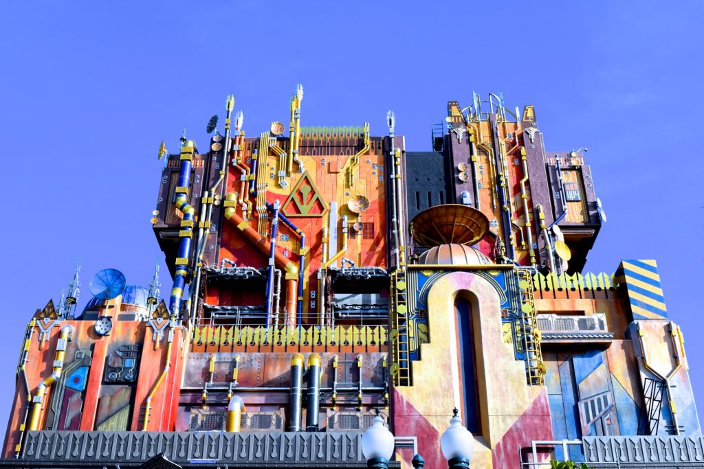
I wonder if the resort is planning on constantly painting the tower as this very bright color pallet gets sun bleached a lot quicker than the original did! 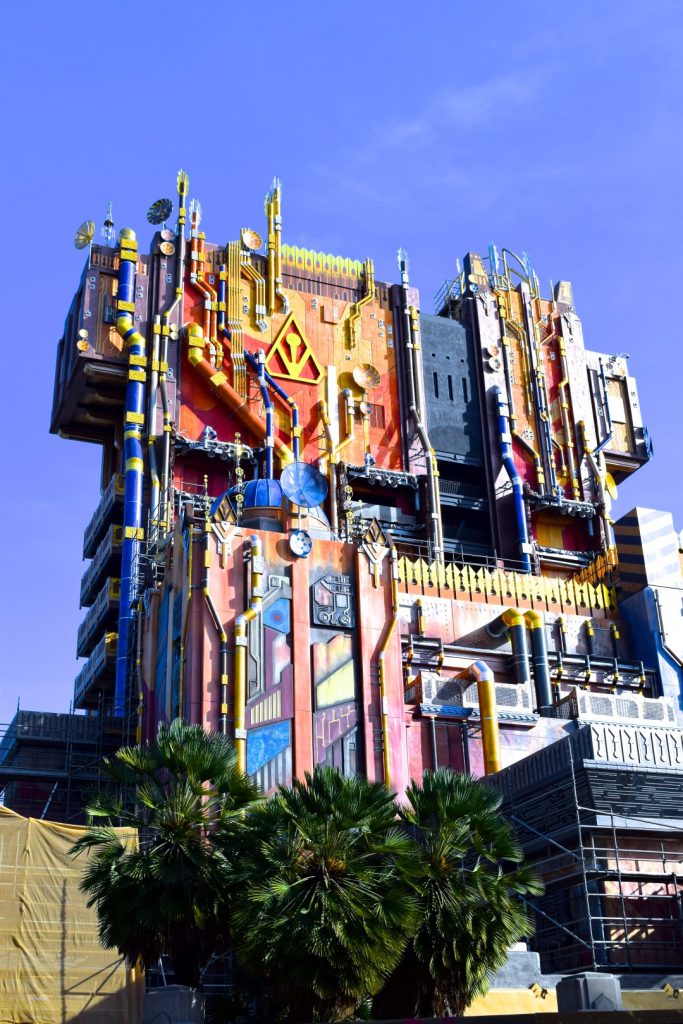
 That was it for this tiny little Guardians of the Galaxy- Mission: Breakout! report! For more brand new reading, check out our Dollywood and Carowinds reports!
Make sure to follow us on our social media for exclusive coverage! Facebook–Twitter–Instagram
Thanks for the update, I appreciate the pics, but I think it looks as horrendous as Joe Rohde’s disgusting stretched out earlobe that dangles with all the rings in it. A far cry from the concept art images, that’s for sure.
I think the ride is gonna be decent, and I don’t mind the fact that they’re making a GOTG ride. It’s the way that they’re going about it. It really doesn’t make sense why GOTG is getting an elevator drop ride. Plus, the outside looks tacky. The color scheme would be fine, but the objects on it look fake. They don’t seem to have any purpose being on there. Why would the pipes be on the outside of the building? Why would there be satellite dishes of all sizes all over the side of the tower?
Regardless, I’m still gonna ride the ride when it comes out. I just hope it’s more than just a cheap overlay.